Designing With the Why
This week’s theme is connecting back in to “the why” - which I’m pretty sure has been a theme in the past as we’ve talked about concept definition and ideation, but I’m coming back to it today because it’s really easy to get caught in execution mode and slowly lose sight of the why, and you start out deviating just a few degrees and before you know it you’ve recreated the plot of Lost.

In execution mode, it becomes easier to focus on just getting shit done so that there’s something that you can get out into the world. Whether you consciously acknowledge it or not, you are making a ton of decisions on a near daily basis while you’re doing that. The reason to connect back to the why is to ensure that those decisions flow from why you’re doing it all in the first place - and in this case, I don’t mean big lofty, aspirational vision. I mean: who are you building something for, why do they need it, and how is your decision going to help them? We talk to users and build personas so that we have a real actual person in mind as we make those decisions. We can consider how whatever we’ll doing will sit with them, what will work well for them, what will be a challenge, how it will make them feel.
This translates into every single thing you do, from big decisions to small ones. One that jumps to mind involved a team making some very deliberate decisions about how to write their UX copy in a voice that felt approachable and fun - even as they were asking people to do things they might not be naturally inclined to do. That’s a big decision (give it a natural voice) that is reinforced by probably like a thousand micro-decisions about how to write every single sentence. This is a total gestalt play: the effect of all of those decisions working together is much, much greater than the sum of all of them.
The reason I want to harp on it now also is because making those decisions in the right way for the user from the beginning sets off a virtuous cycle: as in the example , the more you build trust and intrinsic buy-in from the user, the more you can ask them to do, the broader the emotional spectrum you can cover with them. This is one of the key elements of making something feel magical, not just functional.
So, before you dig into that next crank session, make sure you’ve got the voice of the user in your head reminding you why you’re about to crank in the first place. And then crank away.
Want to see an amazing example of this in action? (And also the secrets of experimentation) Go and track down the documentary El Bulli: Cooking in Progress.
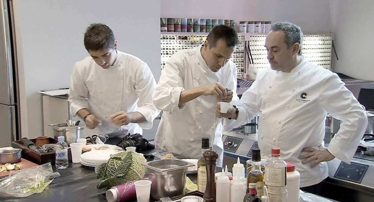
You want to see rigorous experimentation? You want to see a whole lot of low risk failure? You want to see an explicit pursuit of creating something seemingly magical? It’s all there. My favorite moment in the film comes in the midst of a “goof” - for a dish that is meant to be mixed and served at the table, the chef accidentally brings a wrong ingredient and just kind of runs with it. He comes back to the kitchen and legendary hardass Ferran Adria and immediately tells him what happened, and Adria’s response is, “let’s try it and see how it is” and they immediately reproduce the mistake and sample it, deciding that it’s actually pretty good. Is that luck? Hell no, that’s reaping the fruit of the kind of deliberately developing a sensibility. 90% of the success was already baked in from all the work that came before.
All of that, and it’s just such a pleasure to watch a team of people pursuing the highest levels of excellence together and settling for nothing less than amazing. Highly recommended.

Member discussion